Potawatomi Overlook, Door County, Wisconsin. 6x8 inches. Plein Air.
Spring is coming, and with the changing of the seasons comes a whole lot of... GREEN! Green can be a difficult color to get right. Here are a few tips to keep in mind...
1-Greens tend to be a darker value than you think - Remember to squint, and check the value of greens in your subject. Compare that value to other objects. You'd be surprised how dark it actually is.
Note the values of the greens in this piece. Pretty dark, compared to the sky and water.
A small black and white gouache study for this painting. The black and white study helps show just how dark of value greens can be.
2-Keep greens subdued - Keep your greens a little more muted than you think you need. Greens in nature are actually very muted. Once your subdued greens are placed and the value is correct, then add in some "punches" of more vibrant greens. One trick you may like is to use yellow ochre for most of your green mixing, to keep greens a little less intense than you want them. Then, dip into the cadmium yellow for those bright accents at the end. It's surprising how little of the cadmium yellow you'll end up needing.
The desert is great for practicing with muted greens. Note the small "punches" of brighter greens in this saguaro and the surrounding bushes. Using a more intense (higher chroma) color is a great way of adding accents, just be careful not to overdo it.
3-Remember atmospheric perspective - Colors change as they get farther away from us, and shift towards blue (in most cases). What's lesser known, however, is that yellow is the first color to fade, which is then followed by red. What this means is that greens will have more yellow in them in the foreground. Greens a little farther away will appear more purple, followed by very blue-greens in the distance. This is another reason I like to save my brightest greens until the accent stage, and keep the cadmium yellow-heavy mixtures reserved mostly for foreground accents.
Here are two detail shots of the greens in Potawatomi Overlook (pictured at the top of this blog post). Note the vibrancy of the foreground greens (left), and the subdued background greens (right). Both the yellow-green highlights and blue-green shadows have changed due to atmospheric perspective. They have decreased in intensity (chroma) and lightened in value.
4-Never use pre-mixed greens - Well, that's kind of a lie. While I do have a couple greens on my palette, and they are useful, I never use these greens as the starting point when I am mixing a green for my painting. Those greens are on my palette for "tweaking" colors only. All of the greens in my painting begin with yellow and blue. If the green needs to be more olive, I'll add some cadmium orange. More grey? Add some alizarin crimson. Needs to be a little higher in chroma? Now, and only now, is it time to add a little bit of Viridian or Phthalo Green. My basic rule of thumb: Never just squeeze out a bunch of sap green and paint a tree with it!
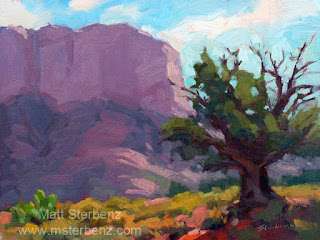
All the greens in this piece, "Courthouse and Juniper", were started with a mixture of cadmium yellow and ultramarine blue. Other colors, including viridian, were later added to tweak the base mixture and create variety.
5-Variety, variety, variety - Having a full-spectrum palette is great for many reasons. "Tweaking" greens is one of them. I like to dip into just about every color when I'm mixing greens, and I like to have every brush stroke be a slightly different green. Trees are made up of thousands of leaves, and each leaf is a slightly different color, and is reflecting sunlight at a different angle. It would make sense, then, for a tree to be made up of many different kinds of greens.
Note the variety of greens here in Fresh Fruit. There are less intense greens, really vibrant greens, yellow greens, blue greens, and very dull greens. The greens in the background are pushed even farther away by knocking back their intensity. The cactus has the most yellow in it's greens, so it visually wants to come forward.


