Monday, November 18, 2013
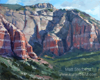
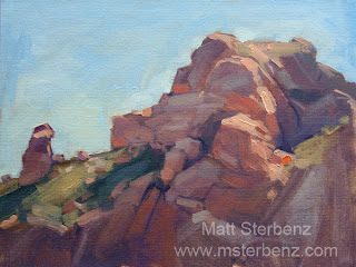
Canyon Study
I think this study might make a good large painting. From the Tortilla Trail in the Superstition mountains. About 5 or 10 miles past Canyon Lake.
"Canyon Guardians" Oil on linen panel, 12x12 inches
Saturday, November 2, 2013
Sunday, September 8, 2013
Lots of Plein Air
It's been a while since I have posted on here. Fortunately I have been painting the whole time.
Back in April I went to the Plein Air painting convention in Monterey. It was worth every penny. I made a road trip out of it, learned a ton, and did some painting on the coast. After the convention I drove up to San Francisco to check out Academy of Art University (Big mistake, they were extremely rude and unwelcoming), and on the way back to Phoenix I swung by Pasadena on a whim to check out Art Center College of Design. They were awesome, gave me a tour, plenty of pamphlets, and answered all of my questions. That's the way a school should be run (Take note, Academy of Art)
Anyway, about the convention. I got to meet James Gurney, which was really great. He signed both of my copies of "Color and Light" and "Imaginative Realism". Such a great person. All of the presenters were very good, some more outstanding than others. Scott Christensen, Ken Auster, Gil Dellinger, and Ray Roberts were among my favorites.
Here's a few of the paintings I did during/after the convention. They're all 9x12 on homemade linen panels (I'll be doing a tutorial on making panels at some point in the future).
I went on a hiking trip to the pines in northern Arizona last month (Strawberry, Pine, and a hike down to the waterfall in Fossil Creek), and came back with another half-dozen paintings. 9x12 oil-primed linen panels again, with the exception of the sunset which is 6x8.
This was my first painting up in Strawberry. I'm not used to painting so much green, so this was a good lesson in forcing myself to keep greens muted. It's much easier to brighten up a green than to dull it down!
There were scattered clouds, and I liked the way the sun would break through on this hill.
A quick study about a mile in a hiking trail in Pine, AZ. I liked the way the warm reflected light hit that log. I had to cut this painting short because a big thunderstorm was rolling in, and we needed to get back to the car in time.
This was painted during my last morning there. I toned the panel with a slightly yellow grey, to capture the golden morning light. I don't like the composition of this piece.
That's it for now. More to come!
Back in April I went to the Plein Air painting convention in Monterey. It was worth every penny. I made a road trip out of it, learned a ton, and did some painting on the coast. After the convention I drove up to San Francisco to check out Academy of Art University (Big mistake, they were extremely rude and unwelcoming), and on the way back to Phoenix I swung by Pasadena on a whim to check out Art Center College of Design. They were awesome, gave me a tour, plenty of pamphlets, and answered all of my questions. That's the way a school should be run (Take note, Academy of Art)
Anyway, about the convention. I got to meet James Gurney, which was really great. He signed both of my copies of "Color and Light" and "Imaginative Realism". Such a great person. All of the presenters were very good, some more outstanding than others. Scott Christensen, Ken Auster, Gil Dellinger, and Ray Roberts were among my favorites.
Here's a few of the paintings I did during/after the convention. They're all 9x12 on homemade linen panels (I'll be doing a tutorial on making panels at some point in the future).
I went on a hiking trip to the pines in northern Arizona last month (Strawberry, Pine, and a hike down to the waterfall in Fossil Creek), and came back with another half-dozen paintings. 9x12 oil-primed linen panels again, with the exception of the sunset which is 6x8.
This was my first painting up in Strawberry. I'm not used to painting so much green, so this was a good lesson in forcing myself to keep greens muted. It's much easier to brighten up a green than to dull it down!
There were scattered clouds, and I liked the way the sun would break through on this hill.
A quick study about a mile in a hiking trail in Pine, AZ. I liked the way the warm reflected light hit that log. I had to cut this painting short because a big thunderstorm was rolling in, and we needed to get back to the car in time.
Got back to the bed and breakfast shortly after painting the log. This one was my first time actually painting in a storm. The summer monsoons in Arizona are something else.
Later that evening we got a really nice sunset. This one was a race against the clock, but I think I got a decent painting out of it.This was painted during my last morning there. I toned the panel with a slightly yellow grey, to capture the golden morning light. I don't like the composition of this piece.
That's it for now. More to come!
Monday, March 25, 2013
It's been a while. New year, new paintings, new post...
A lot has happened in the past few months. Back in January I took a 4-day workshop at the Scottsdale Artists School, with landscape painter Matt Smith. The workshop really opened up my eyes to some new ways of thinking, especially in regards to color. I've been experimenting with his palette, and while I like it, I had to make a couple modifications.
Matt Smith's palette:
Titanium white, cadmium lemon, cadmium yellow medium, cadmium orange, yellow ochre, burnt sienna, alizarin crimson, mauve blue shade, ultramarine, cobalt blue, cerulean blue hue, phthalo blue, viridian hue, Thalo yellow-green (Grumbaucher)
I dislike how this palette does not contain a warm red. You can mix one from orange and alizarin crimson, true, but it is not the same as a good, medium red. I also hate phthalo blue with a passion. It gets everywhere and ruins your mixtures. Cerulean blue hue is a mixture of phthalo and zinc white, and since there is so much white the tinting strength of the phthalo has been knocked down. I can justify using that. Viridian hue is made from phthalo green, which has a much higher tinting strength than real viridian. I prefer to go with the pure stuff.
Anyway, here is my improved palette (In the order I arrange them on my palette)
Titanium white, cadmium lemon, cadmium yellow medium, cadmium orange, yellow ochre, burnt sienna, bright red (Winsor and Newton), quinacridone rose, alizarin crimson, mauve blue shade, ultramarine, cobalt blue, cerulean blue hue, viridian, yellow-green (Utrecht).
This one is a 24x30 Studio painting. It's still not quite done. My camera really brings out the blue in this painting. It's not that blue, but one of the things on my list of improvements is to dull down the blue shadows a bit.
I've also been doing more plein air painting. Speaking of which, I will be going to the Plein Air convention in Monterey, California in April. I'm really excited for it. 5 days of painting and learning. I'm also taking an extra few days to do some painting on my own. Can't wait.
Anyway, here are some recent plein air paintings. I spent maybe an hour on each sketch. 9x12 panels, painted in my Guerrilla box easel.
I also took this photo for fun, just to see how well my painting matched up. This is in Sedona, AZ
That's it for now. I'm going to try to update this thing a little more often.
Subscribe to:
Posts (Atom)


