Wednesday, October 28, 2015

Nocturne practice (2)


Here is a little 6x6 studio piece I painted today. I referenced the sketch from yesterday for color/value. The mountain is illuminated just a little bit from the faint glow of the western sky. The full moon is rising behind the mountain, giving it a sort of greenish halo. 

I'm enjoying the new possibilities in night painting. I'll definitely be exploring it more. 


Tuesday, October 27, 2015

Nocturne practice


This evening I did a little night painting in east Mesa, overlooking the Superstition mountains. It was a great practice piece and I can't wait to do some night painting again. 

My palette: Cadmium yellow light, yellow ochre, cadmium orange, alizarin crimson, dioxazine purple, ultramarine blue, viridian hue (Holbein), burnt umber

Monday, October 26, 2015

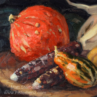
Fall Still Life (Step-By-Step)


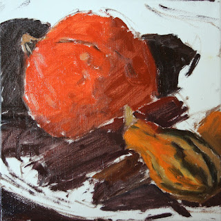
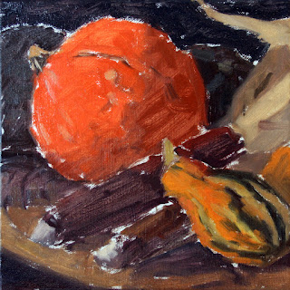
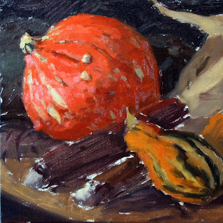
Here are some step-by-step photos of this Fall still life from last week. I'll include a little commentary here and there. 

My palette: Cadmium yellow light, yellow ochre, cadmium orange, cadmium red light, alizarin crimson, ultramarine blue, viridian hue (Holbein), transparent oxide red (Rembrandt)


I started off by drawing in my composition with a reddish brown and a small #2 brush. Then I started blocking in the shadows. Paint at this stage is kept thin. 

Once shadow shapes were established I started blocking in local colors. When I paint local colors, I tend to err on the slightly darker side. I'd rather have to lighten them up later than have to darken them instead. Too much white early on can make your painting look chalky. 
I started getting some slightly thicker paint, defining the forms a bit more in the pumpkin and gourde. I was mainly focusing on the light areas. I'll get the shadowed sides a little later. 


More definition. This time a little bit in the shadow side of the pumpkin.

Building up some of the reflected lights in the pumpkin. The orange tends to go cool in the highlights. They become kind of a pink color rather than getting very yellow. Cadmium red light and white work well for that.

Building up a little bit of definition on the gourde.

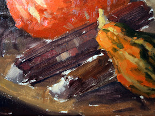
Corn progress 1: Start with a darker than usual local color, painted thinly. Make some guide marks for the rows of kernels.

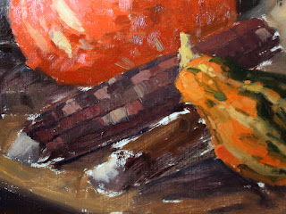
Using a flat #4-#6, I placed some of the first marks, in varying shades of purple with a couple lighter tan colored marks. I was trying to keep the brush strokes following the curve of the corn cob,

More shapes of color. Some wider, some narrower. Trying to keep colors scattered and random looking.

Getting there...

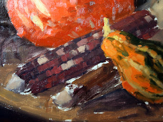
Now the kernels can be defined a little bit. Some reflected light, shadow shapes, and a couple soft highlights finish it off. 

Sunday, October 25, 2015

Working up a Studio Piece from a Plein Air Sketch (Part 2)


The finished painting, 16x26 inches. I kept the brushwork loose in the foreground, and also paid careful attention to edges throughout the piece. Lately I've been trying to use edges as a means of controlling the composition, and directing the viewer's eye. 

The plein air sketch from the Grand Canyon south rim, 9x12 inches.

Paint a Graveyard on Location (Saturday 10-24-2015)


Today I painted with Holbein gouache in the Holy Cross Cemetery in Phoenix. A sign nearby read "Due to the recent drought and water crisis, we will not be planting winter grass this season". Because of our recent rains, I think this is probably the greenest the grass will be until spring comes around.
I chose to focus on a tear-drop shaped headstone, lying in the cast shadow of a tall tree. Blue skylight and grass reflected on the edge of the dark granite. Yellow and orange bouquets of flowers dotted the grounds.
My palette was ultramarine blue, burnt sienna, lemon yellow, and permanent white.


Friday, October 23, 2015

Picketpost Mountain


Here is a painting from this morning at Picketpost Mountain. My friend Don Dean shared this place with me and I have to say it's a real gem. It's located just a few miles west of Superior, AZ, right off the US-60. Very easy to get to. The Arizona Trail (a hiking trail stretching from Mexico to Utah) crosses through here as well. 


Wednesday, October 21, 2015

Phoenix Skyline and Cloud Studies


Here are a few cloud studies from this morning at Papago Park. There's a great view of the Phoenix skyline there. I chose to do some cloud studies. All three of these fit on a 9x12 panel. The first is about 9x3 and the other two are about 9x4

I used a limited palette of yellow ochre, burnt sienna, and ultramarine blue. 

Tuesday, October 20, 2015

Another Harvest Painting


Here is a small 6x6 painting from today. I made the ceramic vase a couple years ago. 

My palette is: 

cadmium yellow light, yellow ochre, cadmium orange, cadmium red light, alizarin crimson, ultramarine blue, viridian hue (Holbein), and transparent oxide red. 

Monday, October 19, 2015

Squash Pen/Ink


Here is a (slightly blurry) picture of a pen drawing of a squash. I used an 05 Micron Pen. This was a good challenge in using pen strokes to define the contours. Using strokes (pen or brush) to define the contours and shapes of objects helps make it appear to occupy space. It allows you to achieve changes in surface quality without having to change value much (or color, necessarily). 

Sunday, October 18, 2015

Another Fall Still Life


Here is another 11x11 still life. I've been enjoying the challenge of painting corn. It's all about simplifying and brush marks. I think I'll have to buy a few more ears and do some more paintings. 

Wednesday, October 14, 2015

A couple pieces from South Mountain

8x10

6x8

I painted up these two pieces this morning at South Mountain in Phoenix. I met up with an artist friend, Pam, who introduced me to Thomas Kitts. Thomas is in town for a demo this week, and we all went out to do some painting. I've signed up for a workshop with Thomas at Scottsdale Artists School in November, and after the wealth of advice I got this morning, I can't wait to learn more from him. 

Tuesday, October 13, 2015

Fall Still Life


Fall is here, and the grocery stores are filled with all the great seasonal produce. Funky looking pumpkins, squash, gourdes, and dried corn. I bought a selection of these things and piled them up on the table, along with one of my ceramic bottles. This piece is 11x11.

My palette here is: Cadmium yellow light, yellow ochre, cadmium orange, cadmium red light, transparent oxide red (Rembrandt), alizarin crimson, ultramarine blue, viridian. 

The transparent oxide red is a handy color when painting still life. It makes some really great darks when mixed with ultramarine blue, and some great dark, muted greens when mixed with viridian. It's a very useful color especially in underpainting. 

I don't normally use the transparent oxide red in my landscape paintings, though. I usually prefer opaque, bright colors (usually because I paint landscapes alla prima). I tend to avoid using transparent colors, as those (at least for me) are better for indirect painting rather than direct painting. 

Hunt's Tomb


This is Governor Hunt's tomb in Papago Park. He was the first governor of Arizona, and he is entombed in this pyramid along with members of his family. There is an iron fence that surrounds the pyramid, but I decided to leave it out. 

There were a few families who came up to watch the sunset, and about a dozen kids decided that watching me paint was more entertaining than the sunset. They all asked great questions.

I used a palette of only secondary colors: cadmium orange, dioxazine violet, and viridian. It was a different way of thinking... purple and green mix together for your blue, green and orange make a very muted yellow (more like a muted dark ochre), and orange and purple mix together for your red (kind of like a burnt sienna). 

I think I'll explore this secondary palette a little bit more. Perhaps even make a few color charts. 

Saturday, October 10, 2015

Working up a Studio Piece from a Plein Air Sketch (Part 1)

This is a 9x12 plein air sketch from the rim of the Grand Canyon. I'm referencing this to make a larger studio painting. 


This is the start of the studio piece. I've gone with a more elongated rectangle. This one measures 16x26. I've simplified the foreground more, and I'm trying to work on edges with this piece. I want to keep the foreground edges soft, especially the trees, to help guide the eye back and towards the central rock formations. The color got pretty washed out in this photo. I've been referencing the plein air sketch for colors, and it's much more true to the first photo above. 

I'm using more of an extensive palette this time. My palette here is cadmium yellow light, yellow ochre, cadmium orange, cadmium red light, burnt sienna, alizarin crimson, dioxazine violet, ultramarine blue, and phthalo green. 

Tomorrow I plan on building up thicker paint and playing around more with edge quality. 


Friday, October 9, 2015

Two From the Salt River This Morning

To make up for yesterday's lack of a blog post, I've got a double update today.

I went painting at the Salt River this morning, and I managed to get two quick pieces in. The first is 8x10 and the second is 6x8. 


The water in this one was tricky. I don't paint a lot of water... something I need to practice much more. 

I think this 6x8 is the better of the two. I like adding saguaros here and there... they can be a really useful way of adding a sense of scale. 

Wednesday, October 7, 2015

Studio Quick Tip: What's Inside Your Paint?

Don't read the front side of your paint tubes! Many manufacturers use brand-specific color names (Winsor and Newton has many, for example, such as Winsor Violet, Winsor Blue, etc). This is a way of generating brand loyalty; customers believe that a color is exclusive to that one brand. When in reality, these colors are made with the same pigments that every other manufacturer uses. 

The best way of finding out what's inside your paint is to look at the back. By looking at the pigments listed, we can find out exactly what is inside. Referencing W&N again, we can determine that the pigment used in Winsor Violet is really just Dioxazine Violet, which is widely available elsewhere.

The Old Holland tube above is made with Zinc Oxide (PW4) and Titanium dioxide (PW6). 

All artist's grade oil colors will have the pigments listed on the back side of the label. Many brands will also list the binding oil(s) used. This is your ingredients list. Some brands list out the name of the pigment, some will just list the shorthand code. This shorthand code is universal and consistent between brands. The Color Of Art has an excellent database which lists all the different pigments and their properties.

By paying attention to what pigments are in your paint, you can make more informed decisions about your supplies.

Tuesday, October 6, 2015

Making Canvas Panels

I made a few canvas panels today, and I took some photos of the process. Here I am using MDF (also known as masonite or hardboard) and acrylic primed canvas. I'm using Elmer's glue.

First, take your wood panel and lay it on top of your canvas. Using a pencil, trace about 1/8-1/4 extra all the way around. It's important to have a little bit of extra wiggle-room.

Using a junk brush, apply some glue to the panel. There's a magic amount of glue to use, and it will take some trial and error before you find it. Too much glue, and it will ooze out the sides. Too little glue, and your canvas won't stick down. 


With the primed side of the canvas facing down, place the glue-side of the board directly onto the canvas. Press down firmly, and then flip the panel over.


Using a soft rubber brayer, roll across the entire panel, working from the center on outwards. Once you are satisfied with the adhesion, place a heavy book on top of the panel and leave to dry. 


After the panel is dry (a few hours), carefully run a razor blade around the edge. 

And there we have it, inexpensive panels ready for painting!

Monday, October 5, 2015

Stretching Pre-Primed Canvas

Stretching canvas is easy! Stretching primed canvas can be a little tougher than raw canvas, but it will save you time in the long run. Here is a tutorial I made on how to stretch raw canvas. I go into greater detail on how to fold corners, too. 

The disadvantage to stretching primed canvas is that you need to get it a little bit tighter; often this is too tough to do if you are just using your fingers. You may find a set of canvas pliers to be helpful.

First, cut a piece of canvas a little bit bigger than your stretcher bars. Since these are thick bars, I've left about 2.5 inches all the way around. 


With your canvas primed-side down (and your stretcher bars upside down as well), staple the canvas down in the center of the edge closest to you. Pull the opposite edge tight and then staple that side down. Then staple the two sides. 

It's important to staple in the center of each bar and work your way outwards, working on all sides together. This ensures even stretching. 


Work your way to the corners, avoiding placing staples a few inches from the corner. 

One of my pet peeves is a badly folded corner. A badly stretched canvas and a poorly folded corner is (in my opinion) a sign of poor craftsmanship. I think every part of a painting, from canvas to frame, should be well-crafted, not just the painting itself.

Form the first part of the fold. 


Pull the outer part of the fold up and over the first. Keep the seam along the corner. It looks the best!

Pull tight and staple. All done!

Troubleshooting:
The trick when stretching pre-primed canvas is getting it tight enough. If the canvas seems a little loose, try painting a coat of gesso on the front (my preference). It will shrink a bit as it dries, and can help tighten the canvas. Misting the back with water from a spray bottle can help too, if you don't want to gesso the front. Wooden stretcher keys can also be tapped into the corners to pull the canvas tighter. 

Once again, you can reference this post for a much more in-depth look at how to fold corners.