Tuesday, December 20, 2011
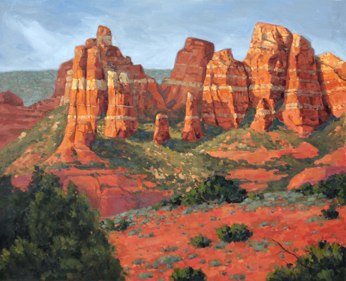
Sedona... finished?
Almost finished, I think. There's still some more changes and final touches I want to add to this before I really call it done. I'm still not too happy with the foreground. I'll have to think about it for a few days. It's just about there, though. I'm anxious to get this framed and up on the wall, and start on the next one.

Sunday, December 18, 2011
Work-in-progress Gourdes
Well, it has been a busy past couple of weeks. We had our grand opening at Montage gallery/studio on Mill, which was a huge success. I talked to tons of people, passed out a lot of business cards, and sold 3 paintings.
The Sedona painting is nearly done. I've been working on it at the gallery while I talk to people. People enjoy watching artists work, and having my easel set up in the gallery has brought in more traffic. Since the painting is at the gallery it means I can't take a picture of it right now. D'oh. I'll have to take an update picture during the week.
I've been working on a little side project. I got the itch to do a very refined painting on a panel. I also decided to take some progress photos of everything, from sketch to completion. The panel is a 5x7 pre-primed Masonite panel from Gessobord. I was pretty impressed with the quality, though they can be a little pricey.
After making some thumbnail sketches and deciding on my final composition, I started working on the panel. I began with a charcoal pencil sketch of the subject (in this case, Gourdes. Gourdes were on sale at the grocery store around Halloween, so I bought some and took a bunch of pictures).
The Photo:

The winning thumbnail sketch:

The Charcoal line drawing on the panel:

Finally its time to start painting! I decided I will be using only Old Holland paints for this. The underpainting was done with Flake White and Burnt Umber.

Because I used Flake White (a quick drying pigment) and thin layers, this was dry the next day. Ready for the first layers of opaque color. My palette here (Old Holland, again) is Flake White, Naples Yellow Deep, Yellow Ochre, Cadmium Orange, Cadmium Red Medium, Red Ochre, Green Earth, Cobalt Blue, Burnt Umber, Ivory Black.
I took the picture indoors (it is dark outside right now) so there is a bit of a glare from my studio lamps.

Now the painting is awaiting glazes. Can't wait to get started on that.
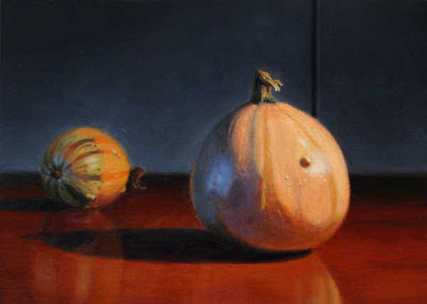
12/19 Well I did some glazing last night, and a little more work with opaque paint. I figured I would just edit this post rather than make another one, and keep all the progress photos in one place. Stuff is really starting to take shape now.

Glazing unfortunately makes the painting glossy, and that makes it difficult to photograph. However since I am using only Liquin as my medium it means the painting dries practically overnight. I might be able to paint another glaze layer on tonight.
12/20 Next glaze layer:
 Things are looking better. I still need to deepen a lot of the shadows, especially the close gourde. I might be able to get that done in 1 or two more glaze layers. For glazing I used my transparent paints from Old Holland. Old Holland paints are rather expensive, but I am slowly building up my stock of colors. I used Liquin as a glazing medium, and a little bit of Flake White for the areas where I needed to bring up highlights. The rest of the colors were Indian Yellow (orange), Cobalt Yellow, Ruby Lake, Green Earth, Viridian Light, Ultramarine Blue Deep, Ivory Black.
Well I think it's finally finished. I applied another glaze layer last night,with the same palette of transparent colors listed above, with the addition of Permanent Alizarin Crimson (I don't have an Old Holland version of this color so I had to use Winsor&Newton). There's some slight color changes I might make in the next day or two but I think that's probably all the adjustments that need to be made.
 On to the next one!
The Sedona painting is nearly done. I've been working on it at the gallery while I talk to people. People enjoy watching artists work, and having my easel set up in the gallery has brought in more traffic. Since the painting is at the gallery it means I can't take a picture of it right now. D'oh. I'll have to take an update picture during the week.
I've been working on a little side project. I got the itch to do a very refined painting on a panel. I also decided to take some progress photos of everything, from sketch to completion. The panel is a 5x7 pre-primed Masonite panel from Gessobord. I was pretty impressed with the quality, though they can be a little pricey.
After making some thumbnail sketches and deciding on my final composition, I started working on the panel. I began with a charcoal pencil sketch of the subject (in this case, Gourdes. Gourdes were on sale at the grocery store around Halloween, so I bought some and took a bunch of pictures).
The Photo:

The winning thumbnail sketch:


Finally its time to start painting! I decided I will be using only Old Holland paints for this. The underpainting was done with Flake White and Burnt Umber.

Because I used Flake White (a quick drying pigment) and thin layers, this was dry the next day. Ready for the first layers of opaque color. My palette here (Old Holland, again) is Flake White, Naples Yellow Deep, Yellow Ochre, Cadmium Orange, Cadmium Red Medium, Red Ochre, Green Earth, Cobalt Blue, Burnt Umber, Ivory Black.
I took the picture indoors (it is dark outside right now) so there is a bit of a glare from my studio lamps.

Now the painting is awaiting glazes. Can't wait to get started on that.
12/19 Well I did some glazing last night, and a little more work with opaque paint. I figured I would just edit this post rather than make another one, and keep all the progress photos in one place. Stuff is really starting to take shape now.

Glazing unfortunately makes the painting glossy, and that makes it difficult to photograph. However since I am using only Liquin as my medium it means the painting dries practically overnight. I might be able to paint another glaze layer on tonight.
12/20 Next glaze layer:
Well I think it's finally finished. I applied another glaze layer last night,with the same palette of transparent colors listed above, with the addition of Permanent Alizarin Crimson (I don't have an Old Holland version of this color so I had to use Winsor&Newton). There's some slight color changes I might make in the next day or two but I think that's probably all the adjustments that need to be made.

Tuesday, December 6, 2011
Work-in-progress Sedona landscape

This painting is 34x26 inches. I'm referencing some pictures I took in Sedona earlier this year. You may recognize the rocks on the left side from a smaller painting I did a few weeks ago. That was more or less a color study for this painting. I've been slowly building up thick layers of paint. The texture is really starting to come out. I've still got a lot to do...
In case you are curious about my palette: 50/50 Titanium White/Flake White, Naples Yellow, Yellow Ochre, Cadmium Yellow Deep, Cadmium Scarlet, Burnt Sienna, Alizarin Crimson, Terra Verte, Cobalt Blue, Ivory Black.
Friday, December 2, 2011
Landscapes 8 and 9
I have a couple more landscapes. This weekend is the Tempe Festival of the Arts, and I will be at my gallery all weekend. I'm going to have my easel set up and I should hopefully be able to knock out a few more of these landscapes while talking to customers. Hopefully I can sell a painting or two while I'm at it.

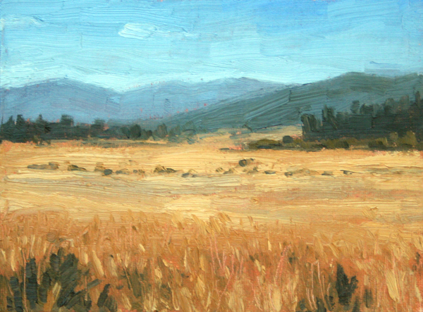
Another overcast landscape with a limited palette. I used Titanium/Flake White, Yellow Ochre, Burnt Sienna, Ivory Black, and a touch of Cobalt Blue in the sky. I passed through lots of beautiful farmland when I was driving across the country earlier this year. Wish I would have taken more pictures.
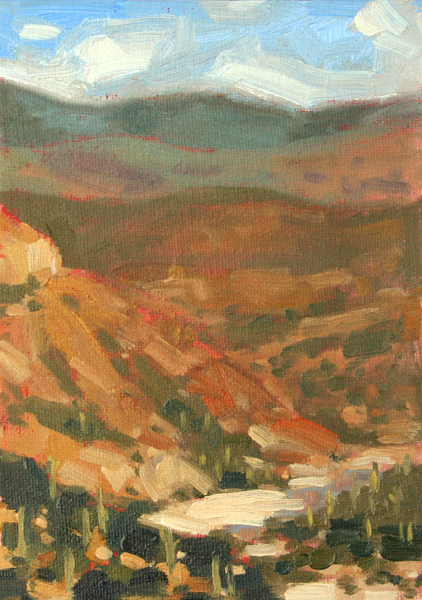
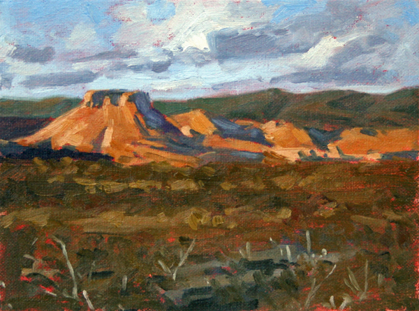
 I believe this is a little ways outside of Globe, AZ. I referenced a photo from an old AZ Highways magazine. Palette: Titanium/Flake White, Yellow Ochre, Cadmium Red, Burnt Sienna, Terra Verte, Cobalt Blue, Ivory Black.

Another overcast landscape with a limited palette. I used Titanium/Flake White, Yellow Ochre, Burnt Sienna, Ivory Black, and a touch of Cobalt Blue in the sky. I passed through lots of beautiful farmland when I was driving across the country earlier this year. Wish I would have taken more pictures.

Saturday, November 26, 2011
100 Landscapes
I decided I'm going to paint 100 small landscape paintings (5x7). Landscape is probably my favorite subject to paint. I love mixing color and creating a sense of atmosphere. I've been trying out some different palettes and doing a lot of experimentation. I'll list the palette I used under each painting.
I went to Utrecht yesterday and bought them out of 5x7 panels. They only had 34 in stock. Guess I'll be going back.
Anyway, on with the show.

 Flake White, Yellow Ochre, Cadmium Scarlet, Cobalt Blue, Ivory Black


This Grand Canyon landscape had a more extensive palette. I'm pretty happy with how this one came out and I like the vibrant colors. I used 50/50 Flake White/Titanium White (to speed up drying time), Yellow Ochre, Cadmium Red, Burnt Sienna, Cobalt Blue, Terra Verte, Sap Green, Ivory Black.
 I wanted to get a little bit more color into this overcast, rainy landscape, so I used my old landscape palette. I used this palette throughout college because it's very cheap to buy and you can mix a huge variety of colors from it. Not to mention its the best way to learn color theory. I used (Winsor & Newton) Titanium White/Flake White, Winsor Yellow, Bright Red, French Ultramarine. When you mix all of those grey and neutral tones from the primary colors, you get greys with a lot more "life" to them. It was fun working with this palette again. I'll be doing it some more...
 The photo of this came out a little too much on the green side. I still have a lot to learn about photography. I don't normally use the palette knife in my paintings, but I used it to make some grass texture on this one. I'm pretty pleased with the texture, so I'll be doing that again I think. Palette: Titanium White/Flake White, Yellow Ochre, Cadmium Red, Terra Verte, Cobalt Blue, Ivory Black.

I've really liked painting these overcast scenes with a limited palette. Titanium White/Flake White, Yellow Ochre, Burnt Sienna, Ivory Black. Once again there was a touch of Cobalt used in a portion of the sky.
7 down, 93 to go.
I went to Utrecht yesterday and bought them out of 5x7 panels. They only had 34 in stock. Guess I'll be going back.
Anyway, on with the show.
(SOLD)
Titanium White, Yellow Ochre, Cadmium Red, Cobalt Blue, Ivory Black.

(SOLD)
I tried working with a more limited Zorn palette here. I eliminated red and replaced it with a muted, brownish red. Flake White, Yellow Ochre, Burnt Sienna, Ivory Black. I think I used a touch of Cobalt Blue in there, but not much.
(SOLD)
This Grand Canyon landscape had a more extensive palette. I'm pretty happy with how this one came out and I like the vibrant colors. I used 50/50 Flake White/Titanium White (to speed up drying time), Yellow Ochre, Cadmium Red, Burnt Sienna, Cobalt Blue, Terra Verte, Sap Green, Ivory Black.


(SOLD)
I've really liked painting these overcast scenes with a limited palette. Titanium White/Flake White, Yellow Ochre, Burnt Sienna, Ivory Black. Once again there was a touch of Cobalt used in a portion of the sky.
7 down, 93 to go.
Wednesday, November 9, 2011
More Landscapes


First up is another snowy landscape. My main focus was on the abstract shapes created by the trees' cast shadows, and the warm/cool balance.
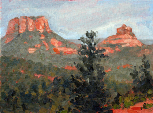
The next two paintings are of Sedona, AZ. I took a bunch of photos there earlier this year. It was overcast and rainy, but the rain brought out some nice colors in the rocks. In the late afternoon the sun finally came out for a brief time and I was able to get some great shots (third painting).
I'm slowly working my way towards more Old Holland brand paints. I have been really impressed with the quality. I've still got a ton of other brands (W&N, Gamblin, and Rembrandt), but as these get used up I am replacing them with Old Holland. They're expensive but really worth it.
Last up we have another banana painting. I think I'm done with this series. I've started to lose interest in them...

Wednesday, November 2, 2011
A couple new landscapes
Landscape is probably my favorite subject to paint. Once in a while I find the time to do a little plein air painting, and I really wish I could do it more often. I'm going to try to make some time available for me to drive up to Sedona again... painting there was a blast.


So, when I want to paint a landscape and I don't have the time to travel or the money for gas, I'll look through my stack of Arizona Highways magazines for inspiration. I don't have a problem referencing photographs for studies, though I do try to change it enough to make it "my own", so to speak. These two paintings took 1-2 hours each, painted on 5x7 canvas panels. I bought a bunch of panels from Utrecht when they were on sale, and then toned them all with thinner, Cadmium Red and Burnt Sienna.

Tuesday, October 25, 2011
Zorn Palette
I've been painting so many bright and colorful things lately, so I decided to stir things up a bit. I've wanted to work with a Zorn palette for a while, so I figured now was just as good of a time as ever. Maybe I'll learn some new things about mixing color in the process...
For those unfamiliar with a Zorn palette (google Anders Zorn for some great paintings), it consists of four colors: Flake White, Yellow Ochre, Vermilion, Ivory Black. I replaced the flake white with Titanium White (I'm not using any medium at the moment and flake white is just too stiff to work with on its own), and the Vermilion I replaced with W&N Cadmium Red Scarlet.
The advantage of this palette is that it forces one to work without blue. It's really the most minimal palette one can work with. I played around a bit by mixing colors, and I decided to make a small chart.
Top row: Rembrandt titanium white, Rembrandt yellow ochre, W&N cadmium red scarlet, W&N ivory black.
Row 2: yellow ochre plus white, cad red plus white
Row 3: black/white greys, green plus white
Row 4: black plus yellow ochre
Row 5: yellow ochre/cad red plus white
Row 6: black plus red
Row 7: selection of flesh tones mixed from 3 or all 4 of the colors

I love the idea of having such few colors to work with. I like the simplicity of it, and I am intrigued by the sheer variety of colors that can be mixed from just these 4. With the palette being warm, the neutral greys look cool in comparison... almost blue. The relationships between color is one of the main driving factors in my art. All this mixing made me want to paint...

Nothing says Fall like some festive, seasonal gourdes. Right? This was painted on a 9x12 canvas panel that I toned with a mix of cad red and burnt sienna (ok, so those aren't technically part of the Zorn palette, but I toned all of my panels the other day and didn't have any white ones). Notice how the grey almost looks blue. I really like the color of the shadows and the cool, muted purples in the background. (Edit: added a better photo of the painting)
I learned a lot from this study. I'm definitely going to be working with this palette a lot more.
Subscribe to:
Posts (Atom)